Created the complete brand identity and digital presence for Powin Energy — from logo exploration and visual system to the marketing website. The brand needed to communicate both cutting-edge technology and environmental responsibility.
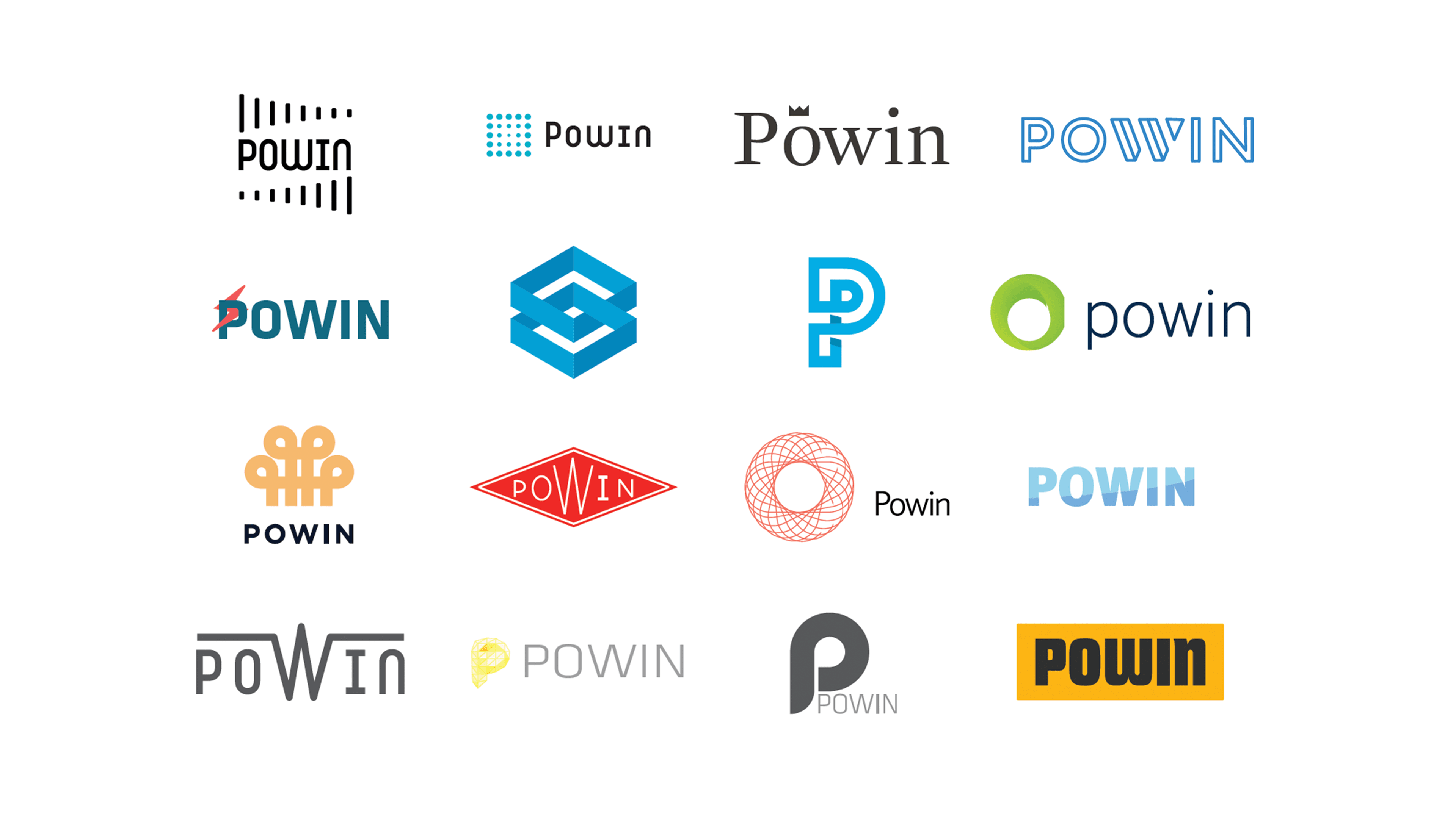
Logo exploration — sixteen directions exploring letterforms, icons, and wordmarks
Finding the Mark
The exploration ranged from abstract geometric forms to typographic solutions — hexagons, leaf motifs, interlocking shapes, and hand-lettered wordmarks. The goal was a mark that could represent both energy infrastructure and environmental responsibility.
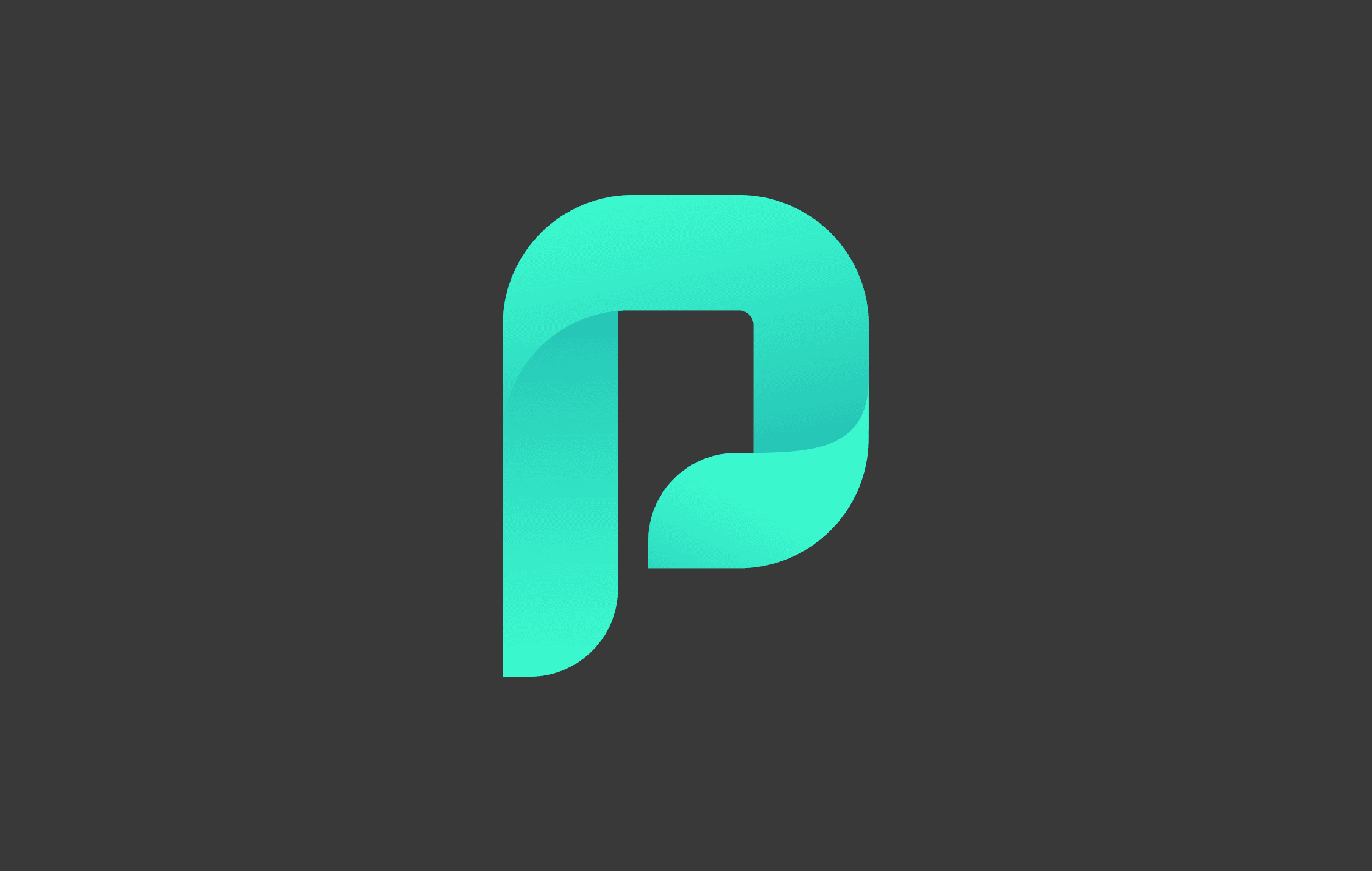
The final Powin mark — a stylized P with a leaf motif, signaling both power and sustainability
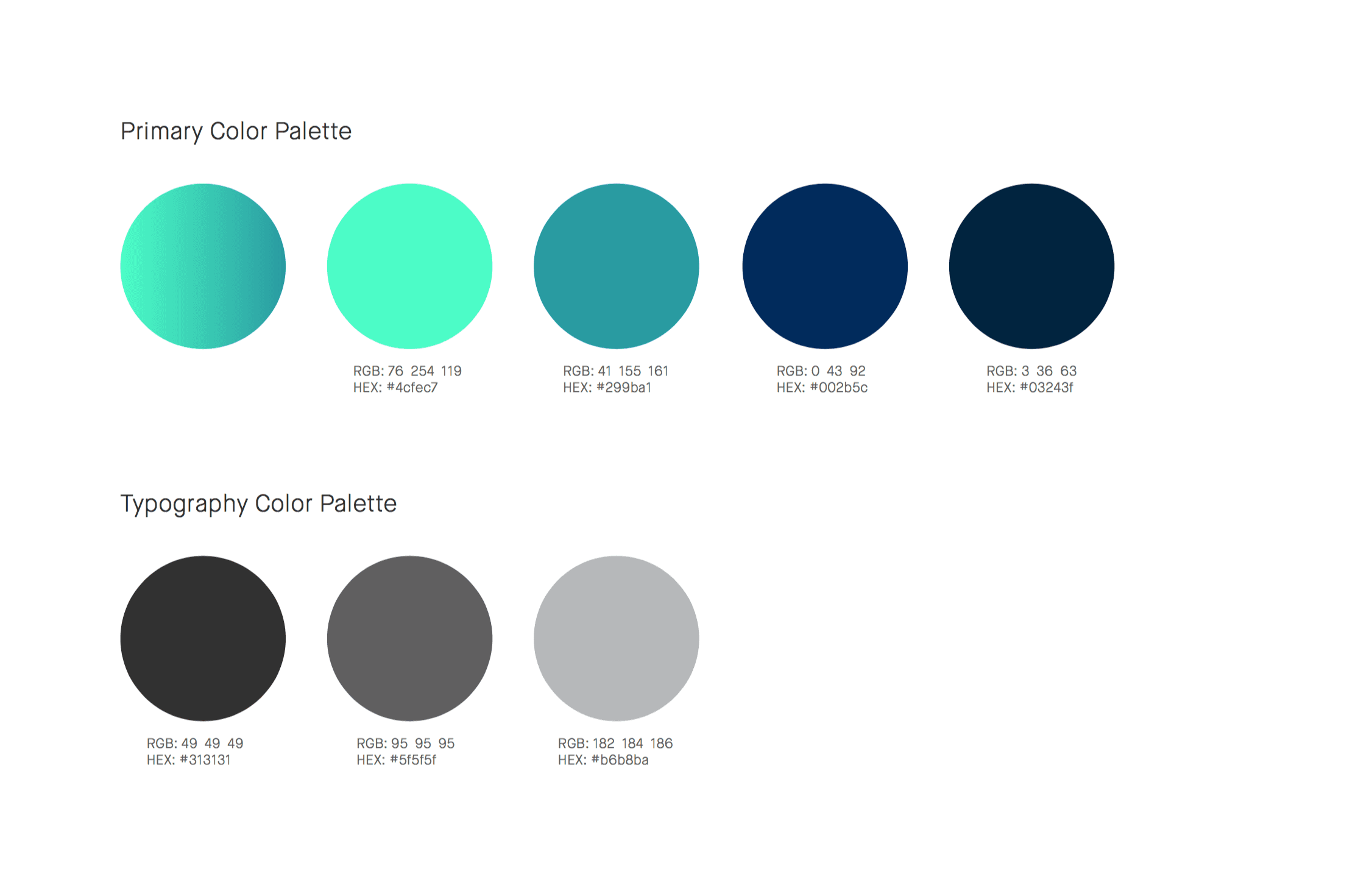
Color System
Built the primary and typography color palettes — teal greens for energy and optimism, deep navies for trust and technology, grays for typographic hierarchy.
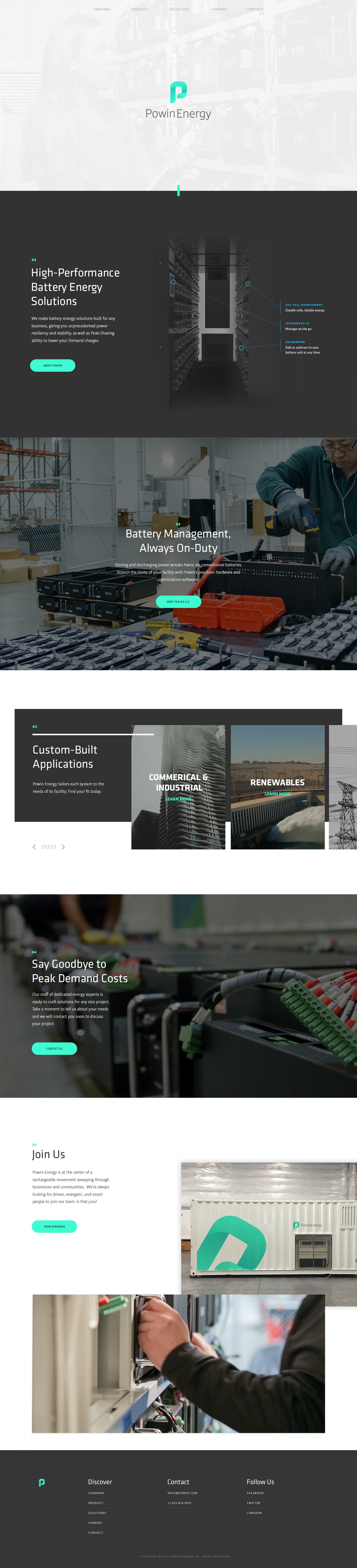
The Powin Energy website — battery solutions, peak demand costs, company information, and careers
Using the Brand
Translating the brand after its creation was both a demanding and impactful real-world experience. The identity system needed to work across the marketing site, product documentation, trade show materials, and investor presentations — all while communicating Powin's position at the center of the rechargeable energy movement.
— Next